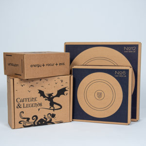
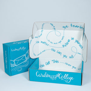
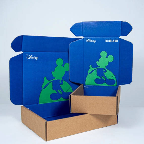
This is one of the most common questions we’re asked when designing e-commerce boxes. In some cases, the decision has been made well in advance, usually when the graphics are developed. On other projects, the board or substrate color can go either way. The below should serve as a guideline for e-commerce box board selection but as always, a short conversation with one of our branded packaging advisors can save you time, frustration, and money.
White corrugated board has several distinct advantages:
- Colors that “POP” – Flexographic inks without costly varnishes added can look rather flat. Printing any color on white board makes the color brighter, compared to printing on kraft which can make colors look darker and sometimes “muddier”.
- Color consistency, especially on flood coats – If you look at any brown (kraft) boxes you will see the brown varies from box to box. Natural kraft colored board is not consistent in color, and the difference is even greater on higher recycled content board. The result is any color printed on it, especially lighter pastels, will vary as well. White board delivers more even, consistent colors.
- White board is typically a board upgrade so it may feature stronger/thicker top and bottom sheets, as well as a stronger fluted middle or medium.
- How much white does your application require – you can get one side white, both sides white or for a clean, bright look, even triple white corrugated board.
Kraft board also provides advantages:
- Cost savings – first and foremost Kraft saves approximately 5% per side (inside and outside) compared to white board.
- Brown board is “greener” – Kraft board has a much more “natural” look and usually offers a higher percentage of recycled content.
- Kraft board looks fantastic under darker colors such as blue, black, brown, and some greens.
- Kraft boxes arrive looking cleaner – white boxes are always clean and attractive on the way out but typically arrive looking dirtier because every mark and smudge is more obvious.
Most popular board color combination for e-commerce boxes?
For RSC style boxes, kraft in and kraft out remains the most common board combination. However, for die cut mailers which represent over 80% of our business, kraft out and white inside is unquestionably the most popular. Keep in mind we usually do not recommend spending a lot of money on exterior graphics. That outside surface gets beat up in shipment and is covered up with tape, labels, etc., which is even worse on a small box when the graphics may be obscured by the standard 4” X 6” or larger, 4” X 8” shipping label.
The best board and ink combination is what is best for you and your brand. As our tag line says, we produce “packaging that communicates” so the key question is, what do you want your packaging to say about you? Perhaps that sustainability is at the top of your list of core values? Perhaps that your products are premium in terms of quality and appearance? Or perhaps that you have invested the time and money to make sure your fragile products arrive safely to your customers?
Whatever your message, we can help you communicate it with the best design work and materials in the e-commerce, DTC industry. Talk to us at 630-551-1700 or contact us through this web site for a new design or a redesign for a whole new look for 2022.
Related post:
https://www.salazarpackaging.com/the-four-most-important-factors-in-dtc-e-commerce-packaging/
https://www.salazarpackaging.com/for-a-unique-d2c-e-commerce-shipping-box-try-triple-white-board/
https://www.salazarpackaging.com/guide-to-corrugated-board-for-e-commerce-shipping/
https://www.globeguardproducts.com/industry-experts/custom-mailer-box-board-color-options/


