For years our tag line has remained Packaging That Communicates because we’ve always believed the graphic and structural design of your direct-to-consumer packaging speaks volumes. So, the question remains, what does your packaging say about you?
Consumers expect and demand a sustainable DTC package.
We’ve been making boxes long enough to know that in 2007, using eco-friendly packaging was a good idea but still optional to most brands. By the end of the decade, consumers demanded and expected it.
Sustainability quickly became an absolute requirement, especially for e-commerce packaging being shipped into the consumers’ home. The retailers were no longer crushing and bailing empty corrugated cases, the corrugated waste had “come home” so making it as minimal as possible was the new objective. The “volume” of packaging waste has always been the most obvious and visible indicator to consumers who may be unfamiliar with the various types and forms of packaging materials used.
This type of scrutiny is most important if you are a green company, selling a green product to a green minded consumer. The market now expects you to “walk the walk”.
What is your brand image?
As most people know we are not graphic artists, and most of our customers have one in-house or enjoy a relationship with an artist they contract with. What often impresses me is the way a graphic design can reinforce the image a brand owner wants to communicate. What disappoints me is when the packaging structural and graphic designs contradicts what and who they are trying to be.
Beyond sustainability, here are a few brand image objectives companies often want and how we can help you accomplish them:
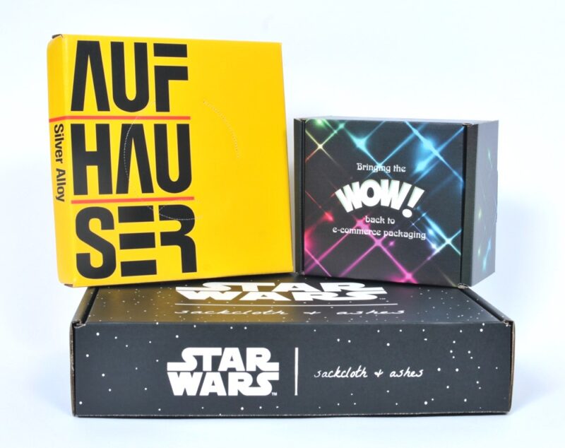
Upscale – this is a feel and look that is unmistakable. First class, top shelf, premium. No matter what you call it, the variety of print processes we utilize can provide anything from a high gloss to a soft touch finish. There is virtually NO GRAPHIC DESIGN that we cannot produce for you.
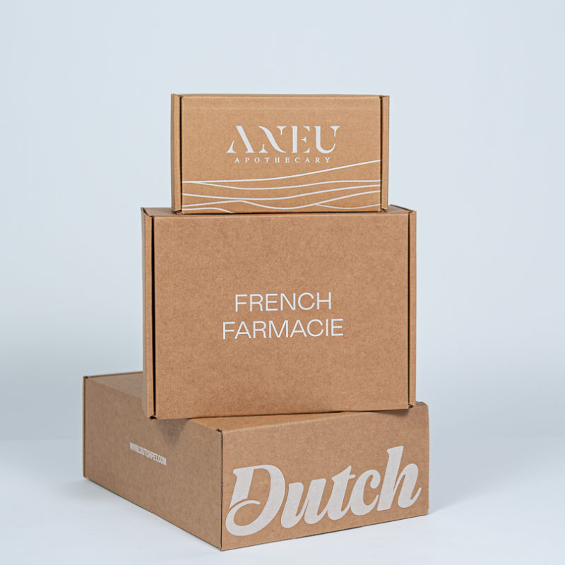
Natural – very similar to the green, sustainable goal but is focused more on the clients’ ink colors and corrugated board choice. Nothing bold and brassy, but more of a soft, mellow look with lots of greens and brown inks. White ink on kraft (our specialty) is often the ink color printed on natural kraft, brown corrugated board.
Modern High Tech – Here is when our ability to create unique shapes and sizes of boxes and internal packaging inserts sets us apart from most other e-commerce packaging suppliers. With our litho label and digital printing capabilities, sharp laminated colors are possible. Also foil or metallic looks are also within our capabilities.
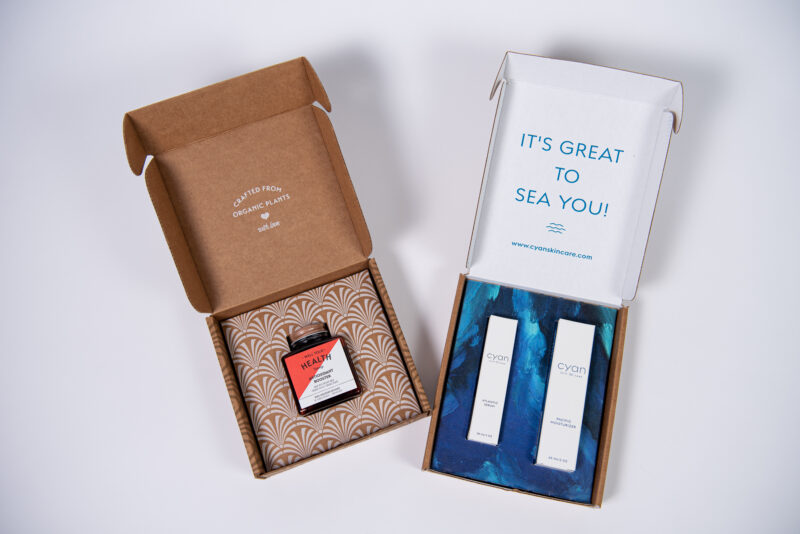
Clean and professional – are often times the desire of cosmetic, personal care, eye glasses, contacts, pharmaceuticals, as well as nutraceuticals. Our unique flood coat color and board combinations are the best. Check out our triple white board option and how attractive and hygienic it looks compared to standard fluted material with a brown middle layer.
Simply put, make sure your packaging is consistent with your brand image and marketing. The fact is that the best and correct packaging is probably very affordable if you choose the right partner to produce them for you.
Call us at 630-551-1700 or contact us through this link. Our very experienced branded packaging advisors are ready and willing to help you.
Related posts:
https://www.salazarpackaging.com/packaging-branding-and-communication/
https://www.salazarpackaging.com/the-high-cost-of-your-outdated-e-commerce-packaging-design/
https://www.salazarpackaging.com/top-ecommerce-packaging-trends-for-2026-and-lessons-from-2025/
https://www.salazarpackaging.com/the-4-most-important-things-when-creating-a-new-e-commerce-package/